IGEL Blog

Home Office 101: Key Workspace Elements
Does your home office need a better design? Or, if you’re snickering because there never WAS a design, and your home office is a haphazard afterthought, this blog will help you change all that. You’ll learn the essential elements of home office design and successful workspace set-up strategies through actual Restoring Order client projects.
Room Arrangement
Let’s start optimizing your workspace with the arrangement of your home office.
Well-chosen and placed furniture is key to optimizing and enjoying your space. But all too often, we toss in a desk (or two) that we got on sale, and resume the rat race without expanding our efforts.
A perfect example of a poorly furnished and arranged office is seen below on the left. These his-and-hers desks were acquired by the client at a local office supply store and they just weren’t working:
- Additional file cabinet space was needed since the desks didn’t offer sufficient storage
- The surfaces were piled high with equipment, leaving little workspace
- The desks were awkwardly positioned in the room, leaving the client’s back to the window
Central vs. Perimeter Workspace
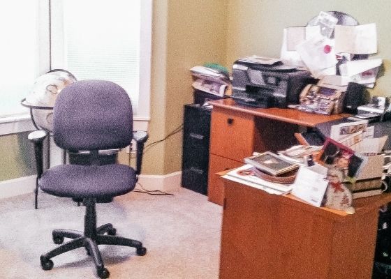
When designing a home office workstation, we all too-often ignore the mess and “work with what we’ve got.” Yet, your home office is the hub of professional and personal life and deserves some time, attention, and resources.
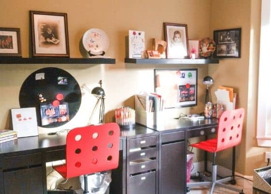
To remedy this haphazard home office, we took the time to measure the space and really zoom in on the client’s priorities. Her priorities included ordering and beautifying the space for use by multiple family members. We reimagined the room arrangement accordingly as you will see in the “after” picture on the right.
- We moved the workspace to the perimeter of the room instead of the center of the space to improve usability and aesthetic. In this arrangement, the line of sight from the office door provides an unobstructed view to the bay window with natural light flooding into the office.
- Instead of continuing with the existing desks, we acquired more modern, narrower, conjoining desks to create an elongated workspace. Using the walls to anchor workspace can actually make a room seem larger while in fact offering more workspace.
- Each workstation was outfitted with the supplies and systems needed for that user
- We inventoried the supplies and files, pared down, and matched the customizable under-desk storage compartments to inventory. This is so much smarter than forcing your “stuff” to fit inside a few standard drawers offered by most storage cabinets and desks!
When re-designing your workspace, zoom out and take an aerial view of the room, list what’s not working, and imagine new possibilities.
Desk Facing Back Wall
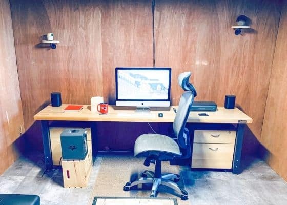
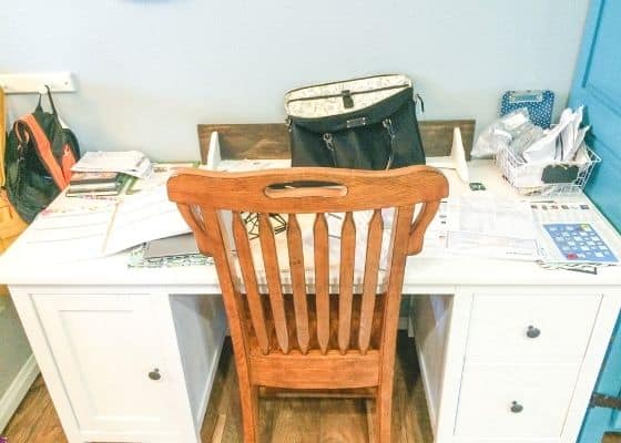
I’d like to note that while the perimeter workspace arrangement generally works on SIDE walls, I do NOT recommend facing a desk to a BACK wall – it’s isolating and austere, as you can see in this photo above.
Others will naturally feel they’re interrupting you if you’re facing away from everyone.
While a “holed-up” workstation like this may help you focus; it lacks the light and variety of central or perimeter arrangements.
Floating Desk
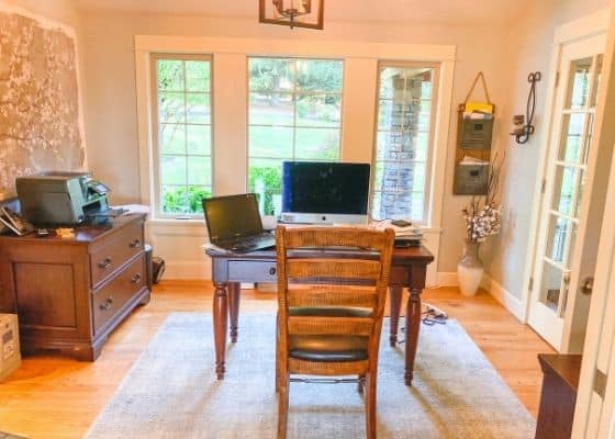
Another room arrangement is to float a desk in the middle of the room. This is popular in executive offices. I only recommend this plan if your work is mostly electronic and you don’t have mounds of paper and stuff you frequently access. If you’re a minimalist, the floating desk arrangement can make you the captain of your office ship.
This strategy can help you
- Get the best view
- Keep a sweeping 360 degree eye on things
- Upgrade the aesthetic of a space
However, some things to consider include:
- Acquiring a beautiful desk that will be the central focus
- Considering a modesty panel for your desk (hiding wastebaskets, etc.) and cord management
- Losing surface space for spreading out work
- Feeling the “fishbowl” experience and need to keep your desk-on-display clear (which can be a good thing!)
There are so many home office design “best practices,” but instead of getting too caught up in that, let your room lead the process. The secret is to apply the design principles that work best for your unique space.
Mentally (or actually) empty the space and start fresh when you reimagine your home office room arrangement. List your priorities, like:
- Tons of workspace
- Extra storage for gobs of office supplies
- Tons of file space needed
- Perfectly clear surfaces
- Room must double as guest space
- Fantastic backdrop and lighting for video calls
These priorities, along with your floorplan, will guide you into optimal room arrangement.
Home Office Desk
Your desk – your primary work surface – is of critical importance to your workspace. We’ve talked about where to place it, but now we need to discuss its features.
Get Real About #FakeDesks
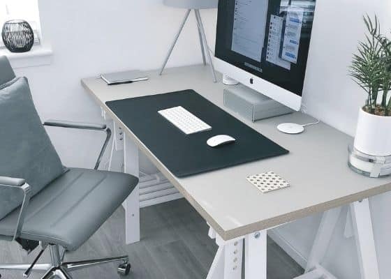
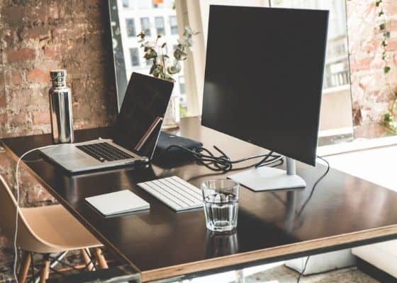
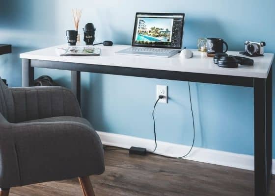
First, let’s clear something up – the desks you see in magazines and in photo sites are NOT real desks. They’re curated images taken for marketing purposes. You’ll also notice that most of these “desks” are in fact tables (which make for better pictures!) Tables have zero storage and zero work is happening on these photo opp surfaces. So, don’t judge your desk against these #fakedesks!
Real Messy Desk

To make you feel better, the photo above is a real client desk. This is how most of the world lives – under piles of paper and disheveled systems that may never have worked for them.
Real desks are command centers and they take daily abuse. They host supplies, projects, and the incoming assault of paper. Our desks are the hub of our personal and professional life and deserve some TLC.
If you can relate to this picture, you will love my blog “How to Unbury Your Desk”.
Optimizing Desk Surface Space
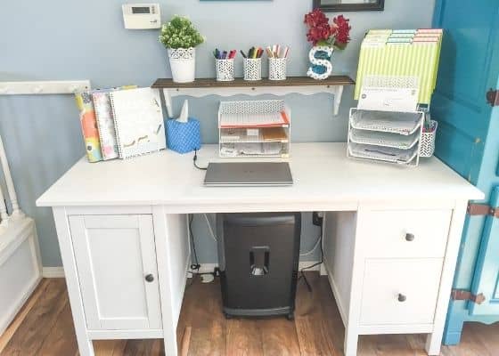
The best feature of any desk is actual work surface to spread out your projects and get to work.
Deep work surfaces like this desk tend to catch everything, like this “before” picture on the left above. This working mom’s home office desk was littered with work, personal, household, and school paperwork and clutter.
To remedy this cluttered desk, I “purposed” the back third of the work surface for paper management systems and the front 2/3 for spreading out work. Think of it like this: the back 1/3 of your desk can be for “parking,” and your front 2/3 can be for “moving traffic.”
Dedicating zones on a deep or long desk surface for both systems and clear workspace will keep your desk working for you and avoid creeping clutter. After a long day in work “traffic,” each of your projects and notepads should find a parking spot.
Table vs. Storage Space
The reason I prefer actual desks (with storage) over tables is simple: most people don’t have tons of drawer space elsewhere. So, with a table as a workspace, you’re likely to create office supply clutter on your surface. Staplers, tape dispensers, clips, sticky notes, notepads, and all kinds of pens, markers, and highlighters need to go somewhere! If all you’ve got for a desk is a table, these supplies will pile up and create visual and mental clutter on your work surface.
Unless you don’t use pens and staplers and sticky notes, for the love of supplies, get a desk with storage drawers not just a table!
Be sure to inventory and pare down your supplies first so you will know how many drawer you’ll require. You can always use an auxiliary storage cabinet for overflow supplies and keep the most-used ones within your desk.
Chair – Your Workstation Throne
You rule and reign from your throne – your workstation chair! If you haven’t already, it may be time to upgrade.
In my experience, most of us sit on a crummy chair to work all day and this wreaks havoc on our bodies. From back pain to leg nerve pinching, our endless sitting sessions cause
Upgrading the Office Chair to the Ergonomic Chair
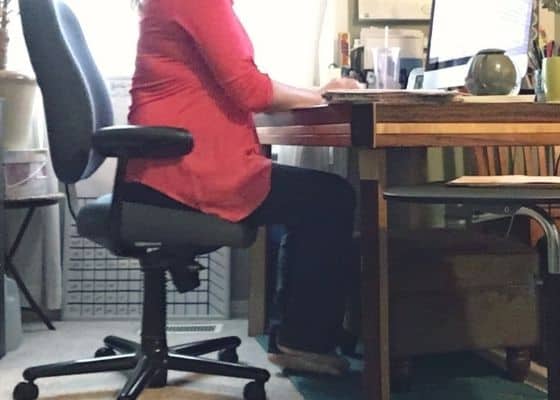

Even if you have an “office chair,” most of us sit on the edge of it, like one of my organizing clients (in the left photo above.)
To avoid back trouble, consider investing in a good ergonomic like we did for this marketing maven (right photo above) that offers the back support you need.
Reference Center
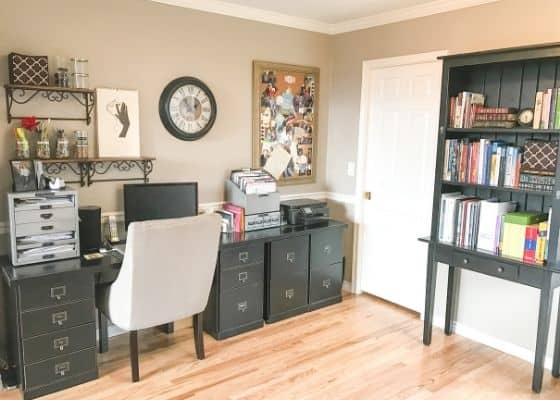
Finally, every office needs a reference center. This includes your filing reference and your books and materials reference.
I helped this executive client transform their dining room-turned-home office space into an elegant and aesthetically pleasing workspace.
The workspace includes carefully chosen storage furniture, including a lateral filing cabinet offering space on top for equipment and drawers for files. My advice is to acquire at least a 4 drawer file cabinet; most home filing systems need household, medical, personal, and financial categories of files. If you produce a lot of permanent paperwork for your professional job, be sure to get enough file drawers for that as well.
Also included in this office is an adjacent open bookshelf for journals, conference material, and professional books. In many cases, I prefer a shelving unit that is closed so that the myriad of reference material is not on display. However, the client liked this open bookshelf that matched the other furniture. If you are going to use open shelves, be sure to arrange the books artfully with accessories like clocks, globes, framed photos, candles, or other décor that brings interest and order to the space. If you can’t or don’t want to take the time for that, then simply arrange the open bookshelf out of the line-of-sight when you look into the room.
Also, before you choose a bookshelf for reference material – inventory your books and materials to ensure it’s all essential. Often, this material can be pared down since we can find most info online.
I hope you feel empowered with some fresh ideas to optimize your workspace. Congratulations, you’ve passed Home Office 101 with flying colors!
For more on successful “home officing,” be sure to check out my YouTube playlist “Home Office Organizing Strategies.”

